There’s something fabulous about your org and you know what it is—the common passion for your cause, lives and policies you’ve changed, your voice in the community—these are the grand things you see in skywriting when you think about the meaning of your work.
But there are also the ground-level perks: your historic brick office, the diversity of your staff, the beignets Raul brings in every Friday…in other words, the day-to-day joys of your work culture.
All of these characteristics can play into your nonprofit’s brand identity and be leveraged to draw the right person to join your team. The question is: Are you using your org’s unique mojo to improve your hiring…or are you mired in the soul-crushing professional jargon of a by-the-books job ad?
If you want to attract the candidates that will gel best with your work culture and mission, your org’s personality must be reflected on your job page. Even if your nonprofit is established enough to be a household name, or the title of a 1978 disco hit single, presentation and voice still matter, particularly with millennials and creatives. Here are our recommendations for making sure you are effectively working your org’s brand in the hiring process.
Outline the values your team shares
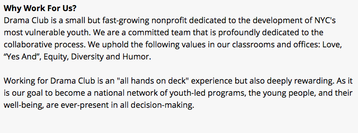
It’s important to communicate your org’s common values to attract candidates who will fit in and thrive there. If your team shares a philosophy of diversity, counter-culture living, grass-roots led initiatives, or personal empowerment, include this in the ad. If preserving natural spaces, keeping plastic out of the oceans, fighting for human rights or social justice are what gets you fired up, tell the candidate why this is.
Stating your shared philosophy in the job intro itself is not only a hook (or filter to eliminate incompatible job seekers), it can also serve to inspire and energize the truly ideal candidate. When a candidate feels their personal beliefs are reflected in an org’s philosophy, this is where the real chemistry and magic happens. Make sure yours comes through loud and clear like in this example from Drama Club, a New York theater nonprofit.
 Focus on your mission and how you're making a difference in people's lives
People are drawn to work at nonprofits for those things that can be hard to come by at for-profit companies—ethics above money, community above corporation, quality of life above status and wealth… Make sure your organization is tapping into these draws of the nonprofit universe through the language of your job description. Put your mission front and center. Fill out the "Awards and Accolades" field and include examples of your org’s successes, so candidates know that they’ll be part of a team that can deliver results for the cause they’re passionate about.
Highlight what makes your organization a fantastic place to work (all of the perks!)
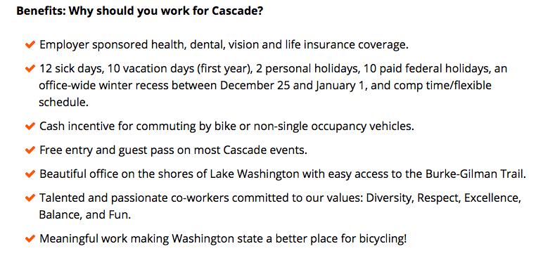
Every organization has more to offer than salary and benefits. These details are important to include—they are the cream in the cannoli of formal compensation— a beautifully located office, open office layout, annual retreats, relaxed dress code, possibility of working remotely, flexible hours, access to a community garden, etc.— include these details in your benefits and compensation info. They are not negligible details, they are, in a way, the very heart of your work culture.
Here’s an on-point example from Cascade Bicycle Club in Seattle:

Be clear and concise, and make your job listing fun
Getting stuck in a boring, meaningless job is one of the great collective American nightmares. If the language of your job description is dry and passionless, then your org (and the job itself) will appear dry and passionless. Ditch as much of the professional / academic language as possible in your ad. Millennials, innovators, and creatives in particular may be turned off by a generic and overly-formal ad, and these are three categories of employees you need on staff.
Here’s another great model from the nonprofit investigative journalism outfit ProPublica in their ad for a Newsletter Editor. You don’t have to go full-blown casual, but you should be moving in this direction:
 Make your profile page tight and attractive
Our final piece of advice may seem obvious, but we still see a lot of pages that have too much text and no visual hook. Keep the organization description itself to two to four succinct paragraphs. Write about as much here as on your Facebook “About” section (which is to say less than you would on your website, but more than you would on Twitter). You’ve crafted all of this before, so it’s really about knowing how many scoops of “About” you’re dishing out (the answer is two to four scoops, no less or more).
Add engaging photos and videos to your profile page. Bland stock photos, logos, and pictures of buildings (unless iconic) are usually not your strongest choice. Instead choose high resolution, well-composed, colorful pictures of your org at work in the office or community. Photos that give the applicant a glimpse into the human side of your organization, or capture the spirit of your cause will increase your chances of attracting the right fit.
Once your profile is up, invite a second set of eyes from your team to give your page a once over and make sure it hits these points of simplicity, directness, and visual appeal. Double check that all fields on the profile page and job ad look attractive on the actual site. Go easy with bold and italics, and as always, proofread.
Ask your coworker: Is this who we are? Does it capture the things we love about working here? If the answer is yes, you have a successful ad. Good ads not only draw the best candidates, they raise the quality and enjoyment factor of the entire process.